Constant Contents
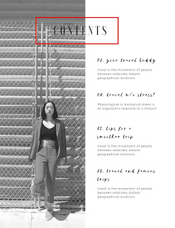
I believe that the table of contents has to flow cohesively with the front page. I am a perfectionist and when it comes to coming up with the perfect layout for my magazine I am extremely indecisive. I have many options of what I want to work with. With the first option I like that its clean and minimal and has the red accent in the contents it adds some color which is what Im going for the contents, since the front page doesn't have much cover. In the second option it has pops of red which is what Im going for( I like primary colors) the only problem i have with it i feel like it's too plain and it doesn't flow with the front page. The third option plays around with more colors while its still black and white the pops of color add life. The third option also has a gray border like the front cover that has a frame look.
 |
When looking up the best way to layout the table of contents in a magazine the article talked about how its important to be able to distinguish the contents of the magazine. Some table contents don't even have images, the author also said that the typography is also very important because it continues to keep the reader engaged.
-CN
Nikola. “Structure of the Magazine.” Magazine Designing, 14 Oct. 2013, www.magazinedesigning.com/structure-of-the-magazine/.


Comments
Post a Comment