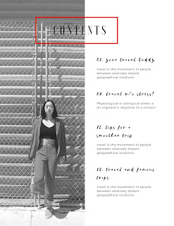
Finally a Front Page!
After several tries I have my front page of my magazine! Let me tell you how good that feels to finally be able to say. I have played around with many fonts, colors, pictures, and boarders. None of them pleased me until now. I went for a clean and monochromatic look. I wanted it to look minimalistic, but also chic like a lot of the independent fashion magazines I looked at. Canva.com facilitated with this process immensely with their easy tools and layouts. I also wanted the front page to be an insight of what the audience will see inside the magazine. Not only is the layout for the Front page important so is the main image.
While doing some research I found that one the biggest things in front covers that grabs the readers attention is the typography. The typography should be bold and should follow what you're theme in a bold way. In my case my typography has two different fonts a black bold "le" in the front. In another research site I read that the front cover of a magazine is like a "shopping window" its the first thing that a customer sees and has to grab the readers attention right away. This very informative article also talked about the main image and how the main image needs to cause curiosity so that it engages the reader to open and take a look at the magazine.The article says that "first impressions are 94% design related." Having a creative connection to an audience is important when it comes to magazine sales, therefore having the perfect front cover is extremely crucial.
- CN
“InDesignSkills.” InDesign Skills, 14 Mar. 2018, www.indesignskills.com/inspiration/magazine-layout-design/.
“Why An Attractive Cover Page Is So Important In Magazine Printing.” Publication Printing | Marketing & Publishing Tips, 29 Jan. 2018, www.shweiki.com/blog/2017/10/attractive-cover-page-important-magazine-printing/.


Comments
Post a Comment